
As a design enthusiast, Interior design was a topic that I have always held a deep fascination. As late night scroller, I came across a brilliant Youtube Channel in Hindi called Interiorz. https://www.youtube.com/@Interiorz
I have previously read up on content in Old copies of Architectural Digest and Apartment Therapy alot. However, due to a lack of in-depth study they never made much sense to me. That’s when I came across this Youtube Playlist by Interiorz
It has been a brilliant primer on the topic and the presenter has made the topic easy to understand with his bite size videos and easy to relate language.
To learn in-depth on the topic, I would recommend watching videos directly.
However, I would now like to recall certain pointers on interior design that stood out to me in these videos.
The video cover all the major topics like :
Line, Space, Pattern, Proportion, Texture, Color etc.
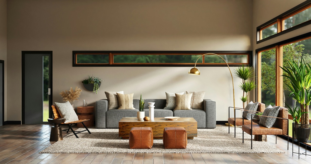
Line : Spaces need lines to guide the eye. Vertical lines help in increasing the perceived height while horizontal ones expand the width and length. Choosing horizontal and vertical is a matter of correcting the dimensional asymmetry of the room. Diagonal lines are good for making a space pop but using too many diagonal lines are a visual clutter and nightmare to keep the viewers bearings.
Space and Proportion : Proportion is the perceived size difference between two objects. For example the size of a sofa and the coffee table. While Space is the the size of the object in relation to the size of the room.
In proportion, the Height of Objects in a Table should be 1/3 the height of the table. While Paintings over a bed should be, Dimensionally 1/2 of the Height of the bed and and Equal to the Width.
Rhythm and Repetition : Odd number of objects look pleasing due to their perceived casualness while Even numbers look stifling and boring. Balance is key.
Color : In the topic of color, as a visually cued person, I knew about things like Complementary, Monochromatic and Split Complementary color palettes. However, it was nice to reminded that Hue = Pure Color, Tint = Addition of White to Hue, Shade = Addition of Black to hue and Tone = Addition of grey to hue.
There was also a thumb rule of 60/30/10 proportion of colors in a room where, 60% should be the primary color, 30% is the secondary or neutral and 10% should be accent color.
Patterns : Male and Female patterns are different. Male patterns are things like Checks and Gingham while Female Patterns are Plaid, Paisley and Polka Dots.
Focus : Some focal points is a room are : Windows and Fireplaces.
Rugs : The front legs of big furniture pieces like beds should step over the rugs. It is also applicable in for Sofas and Coffee Tables. While rugs under dining tables should be big enough to hold the Dining Table, all the chairs and enough space of a minimum of 12 inches around the chairs to the edge of the rug, when the chairs are full pulled out.
Scandinavian Design : Flared legs in Chairs and Tables are a Sign of Scandinavian Design.
Coastal Inspired Designs : Primary colors are Blue, White and Sea Green.
That’s the brain dump for today.
